Fantastic Art
Some artists are able to create entirely new worlds with a click of a lens or a stroke of a brush. Shapes and colors that do not occur in nature fill their works and ensure that we as viewers are completely drawn to the fantasy of the artist. Something we could use, now that we are often stuck to our homes in the Netherlands.
At first glance, photography may seem the least suitable medium for creating unrealistic spectacles; after all, it captures the world around us. But with enough manipulation of material, background, individual elements and especially perspective, these artists manage to create worlds that you could not dream of.
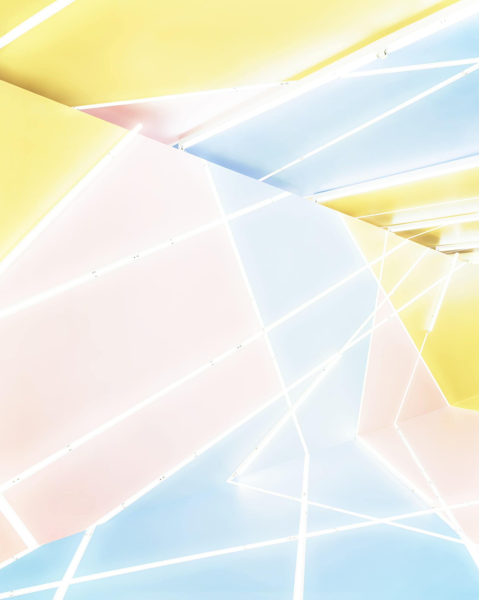
Marleen Sleeuwits, Interior no. 61, 2021. Ultrachrome print on LED light box, museum glass.
Marleen Sleeuwits (1980)
Marleen Sleeuwits will distort an everyday environment for so long that it can no longer be recognized as such. She prefers to work with impersonal spaces, such as empty airports or abandoned office buildings. The materials that are available there, such as colored rods, tape and laminate, become the foundation of her work. Using different techniques, she builds a completely new world, which should portray the identity of the original place. After the physical work she takes her camera, while looking closely at the anatomy of the space and playing with perspective and scale. When taking photos, she often chooses a perspective that least betrays the origin of the image; although she often leaves a small clue, such as a loose socket. Did you think that Interior no. 61 actually consisted of the contents of a stripped-down office? Or Interior no. 64?
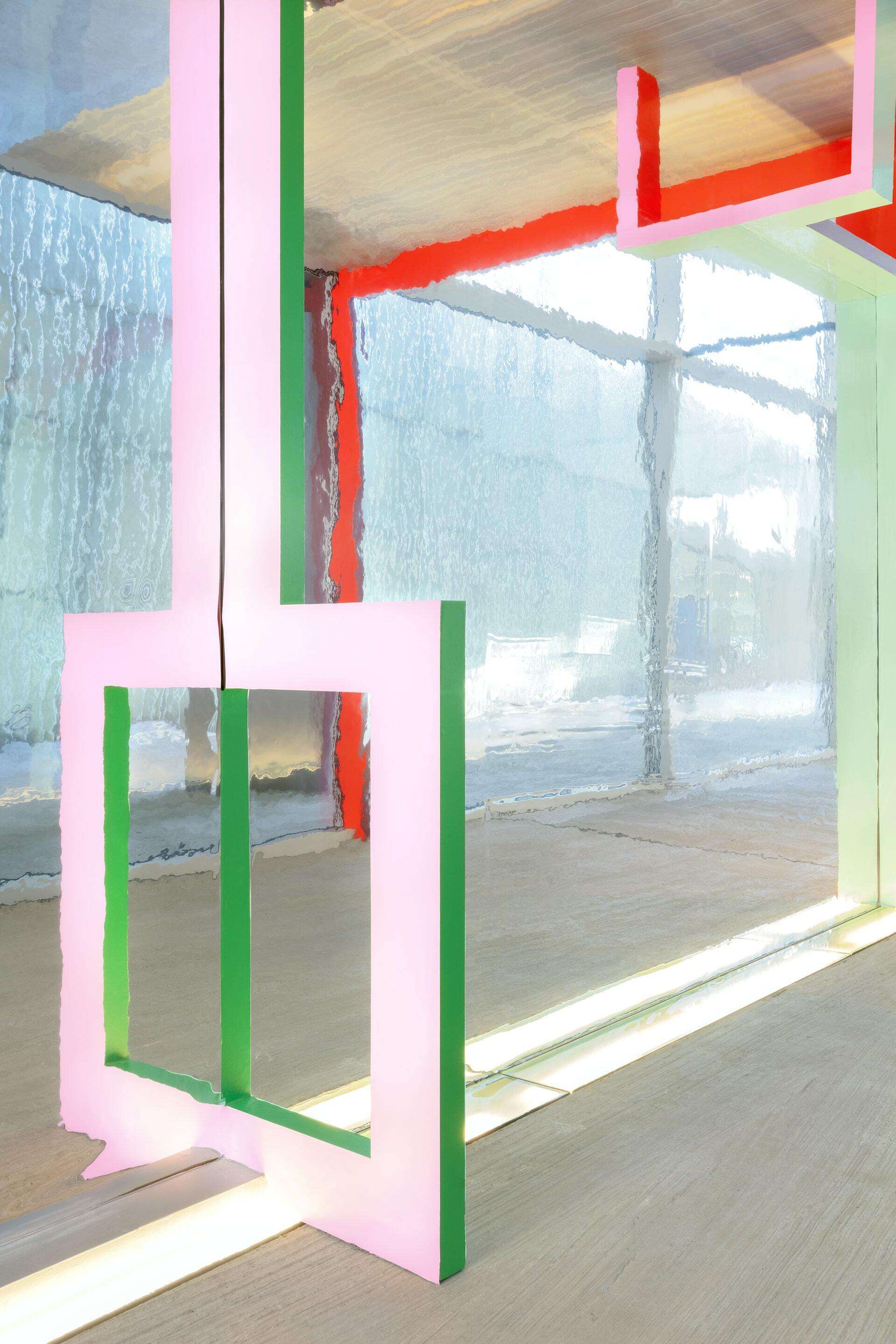
Marleen Sleeuwits, Interior no. 64, 2021. Ultrachrome print.
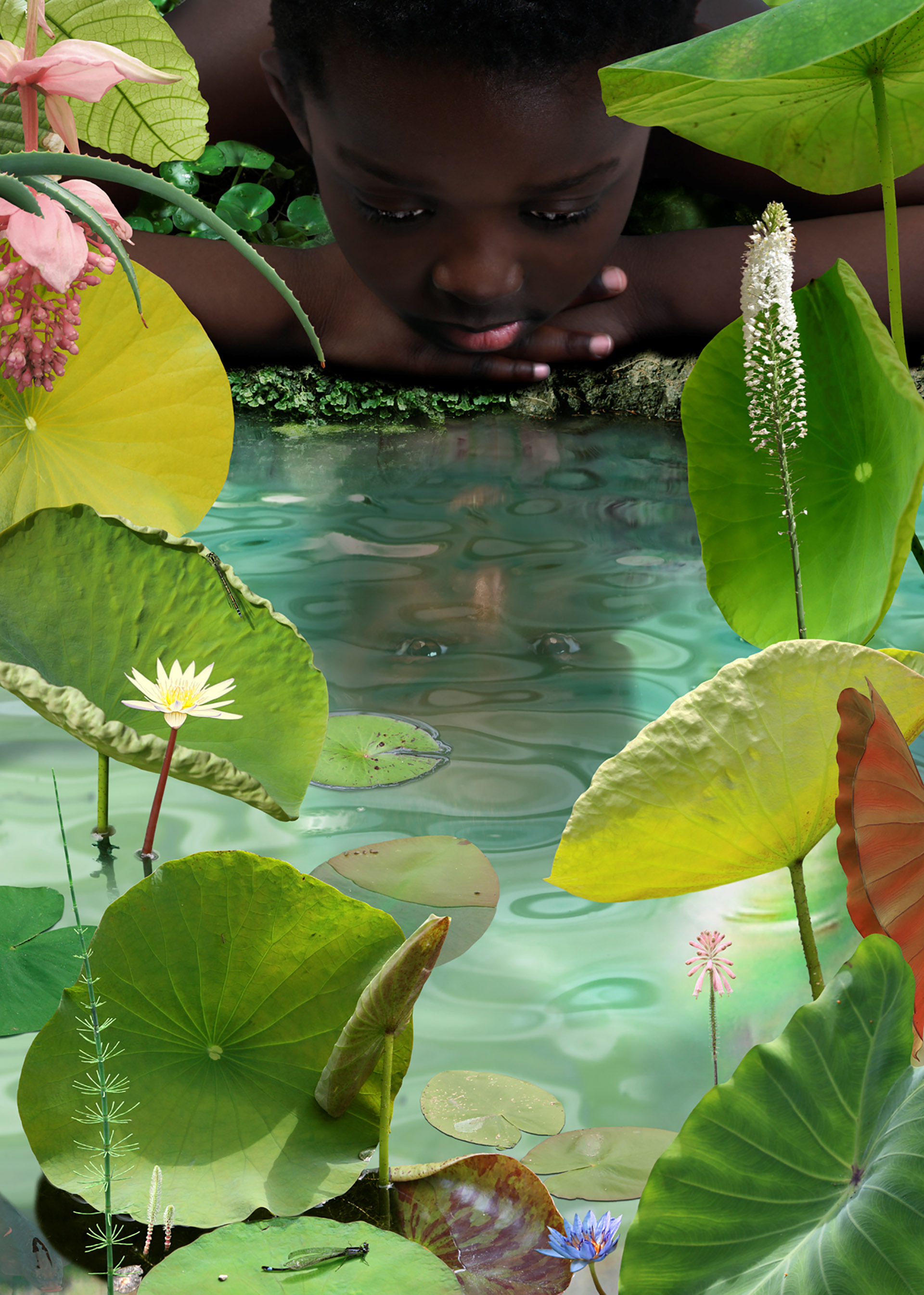
Ruud van Empel, World #23, 2006. Cibachrome print with Plexiglass on Dibond.
Ruud van Empel (1958)
Although this photo seems like a fairytale, artist Ruud van Empel means to depict the world in which we live. He emphasizes that he is not trying to tell a story; that is up to the viewer themselves. Fortunately, there is plenty to see in his work; the carefully composed computer collages consist of all kinds of digital images of people and flora. The saturated colours, high contrasts and clarity of the photos make them appear lifelike and magical at the same time. The depicted plants and children also make the image quite pure and innocent; should we all see the world this way?
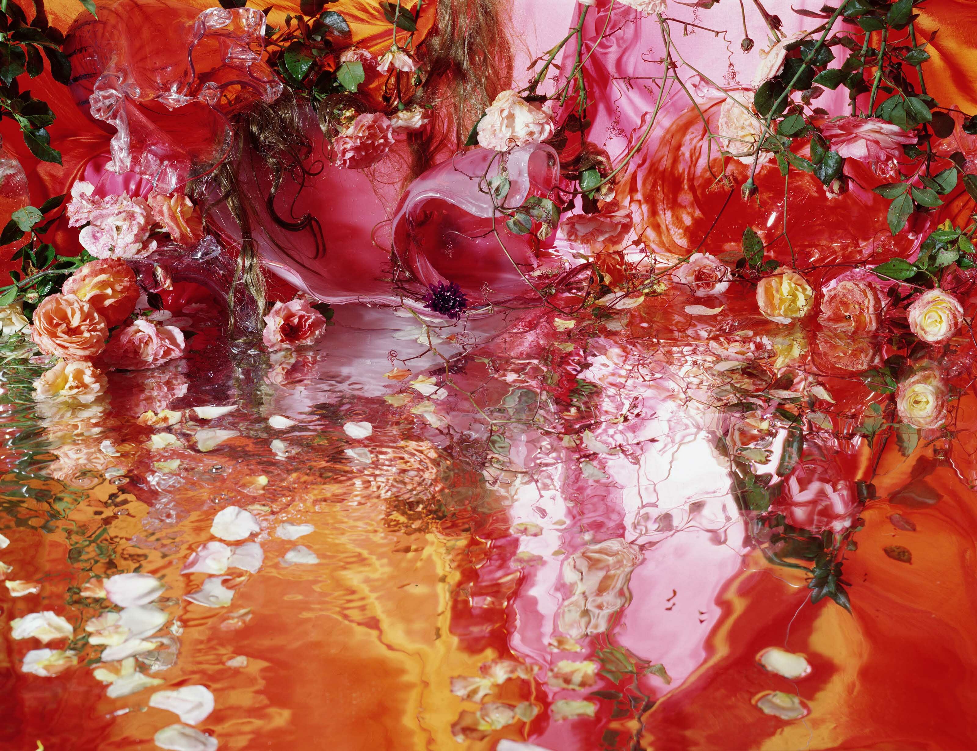
Margriet Smulders, Hair Hemisphere, 2005. Ilfochrome with Plexiglass on Dibond.
Magriet Smulders (1955)
Margriet Smulders' flower photos hide an entire world. Inspired by floral still lifes of the 17th century, she tries to capture and imitate life. She sees the flowers as actors in a Greek tragedy. The dramatic effect of her work is partly achieved by the use of mirrors, which double all elements and give the work a surrealistic atmosphere. As a result, the composition of objects becomes a landscape rather than a still life, in which the objects used mostly lose their original meaning. In Hair Hemisphere we see red and pink flowers, glass vases with crazy shapes and strands of hair. None of these elements is immediately recognizable. That's the purpose; Smulders loves to lose herself in the drama of life, and she translates this into her sensual and emotional art.
A classic technique such as painting lends itself well to creating a world in which you can escape reality. Although these artists have all used real elements as examples and inspiration, they chose to make them their own. These artists unleash their imagination on a blank canvas and create magical colours, shapes and representations from nothing.
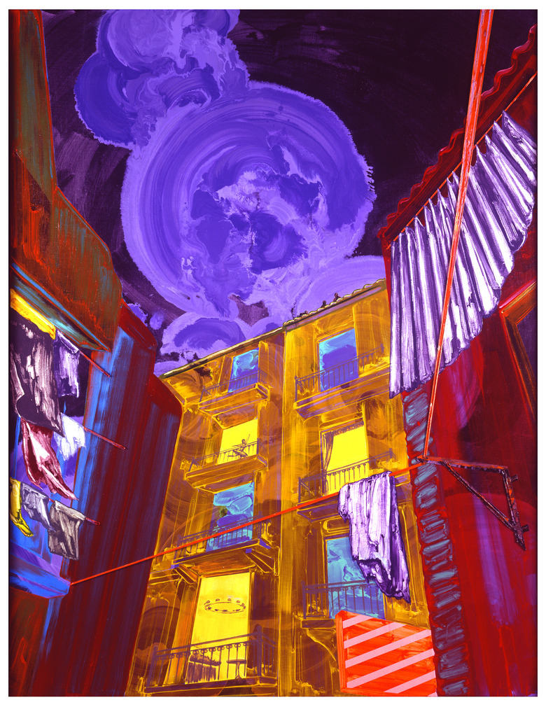
Gé-Karel van der Sterren, Untitled, 2006. Acrylic and oil paint on panel.
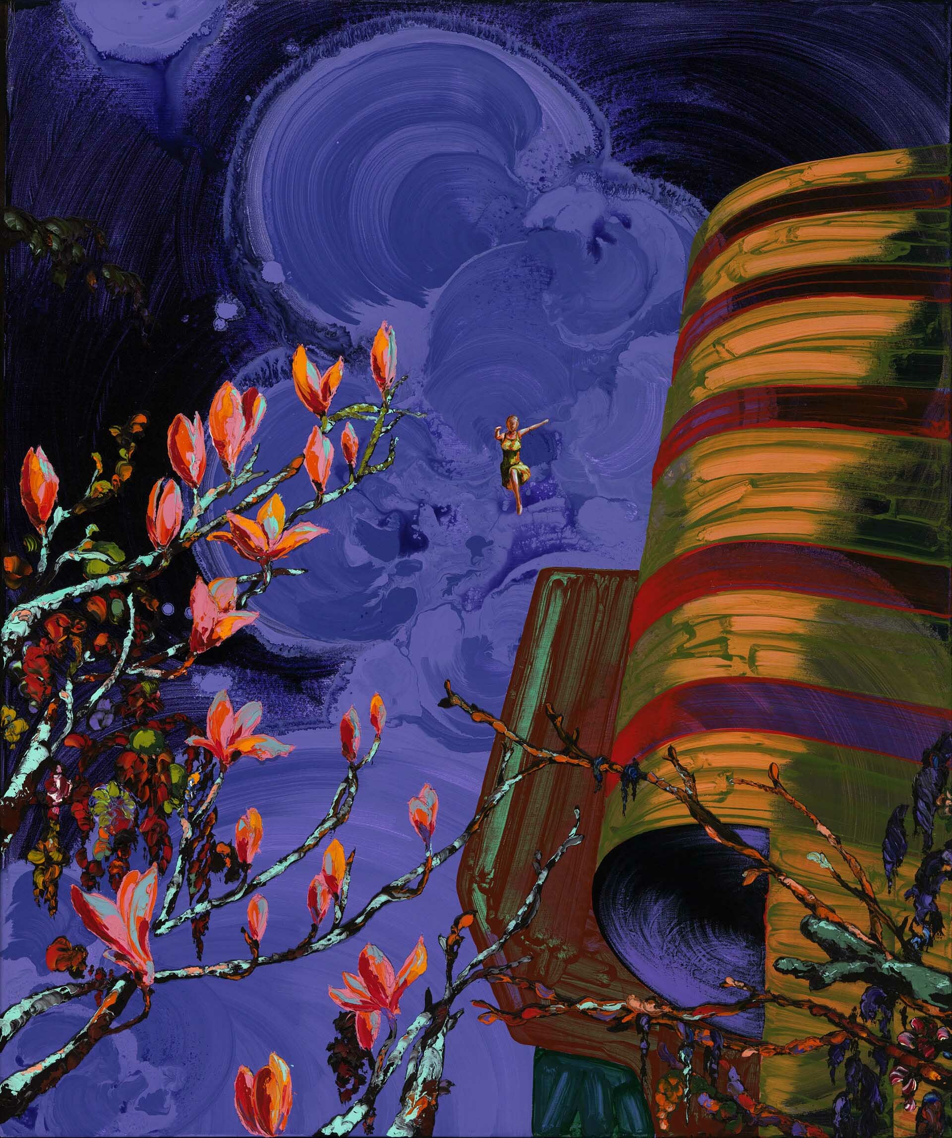
Gé-Karel van der Sterren, Jolly Jumper, 2007. Acrylic and oil paint on panel.
Gé-Karel van der Sterren (1969)
Like Van Empel, Van der Sterren's fairytale paintings are actually a critique of the hedonistic society in which we live. Because of his cheerful and bright use of color, visually all that remains of this criticism is a grim and indefinable feeling. That's exactly the point; Van de Sterren does not want his paintings to convey a clear message. A good example is Jolly Jumper. The bright colors of the painting and the comic book references (Supermanpose and the title Jolly Jumper; Lucky Luke's horse) are a stark contrast to the menacing, dark branches that seem to stretch out like arms. Will the depicted woman fly away or fall and be 'caught' by the branches? This shows the duality in Van der Sterren's work. He mainly uses his palette and virtuosity to transform everyday objects and scenes into a more elusive scene. That is how he changes our perception and we see a more interesting, less black and white world.
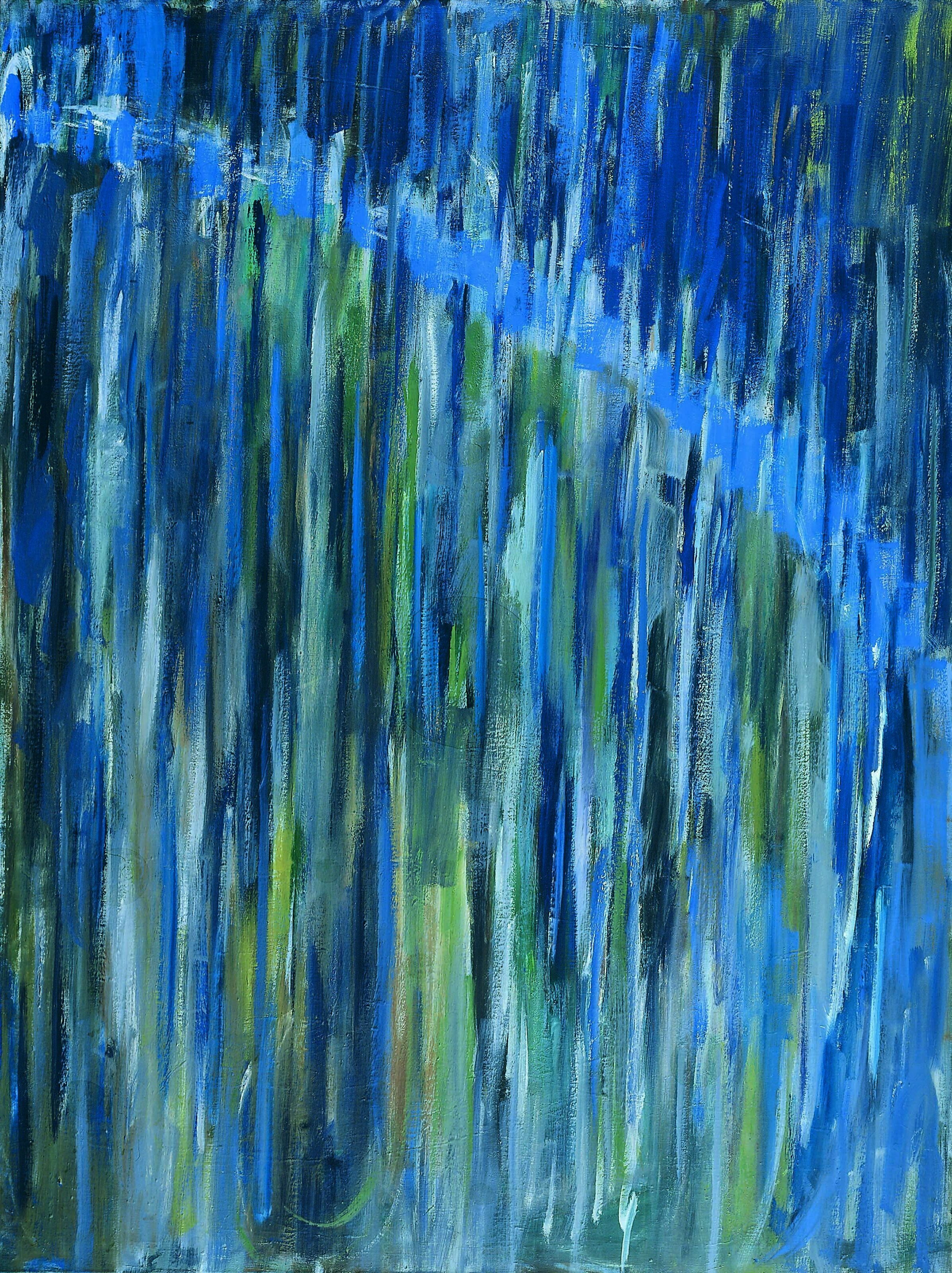
René Daniëls, Comet, 1979. Oil paint on canvas.
René Daniëls
In Comet we see a lot of blue-green colors and something that looks like an streak. René Daniëls's work floats between the figurative and the abstract. Although he usually takes realistic things as subjects, his style is rather abstract-expressionist. This duality is a big theme in his work; he considers ambiguity very important, and sees art as a game that will never yield to a single meaning. It should always de possible to form multiple interpretations. He calls his method “visual poetry”, wherein words and their associations play a major role. Would you have seen this starry sky if the title was not Comet?
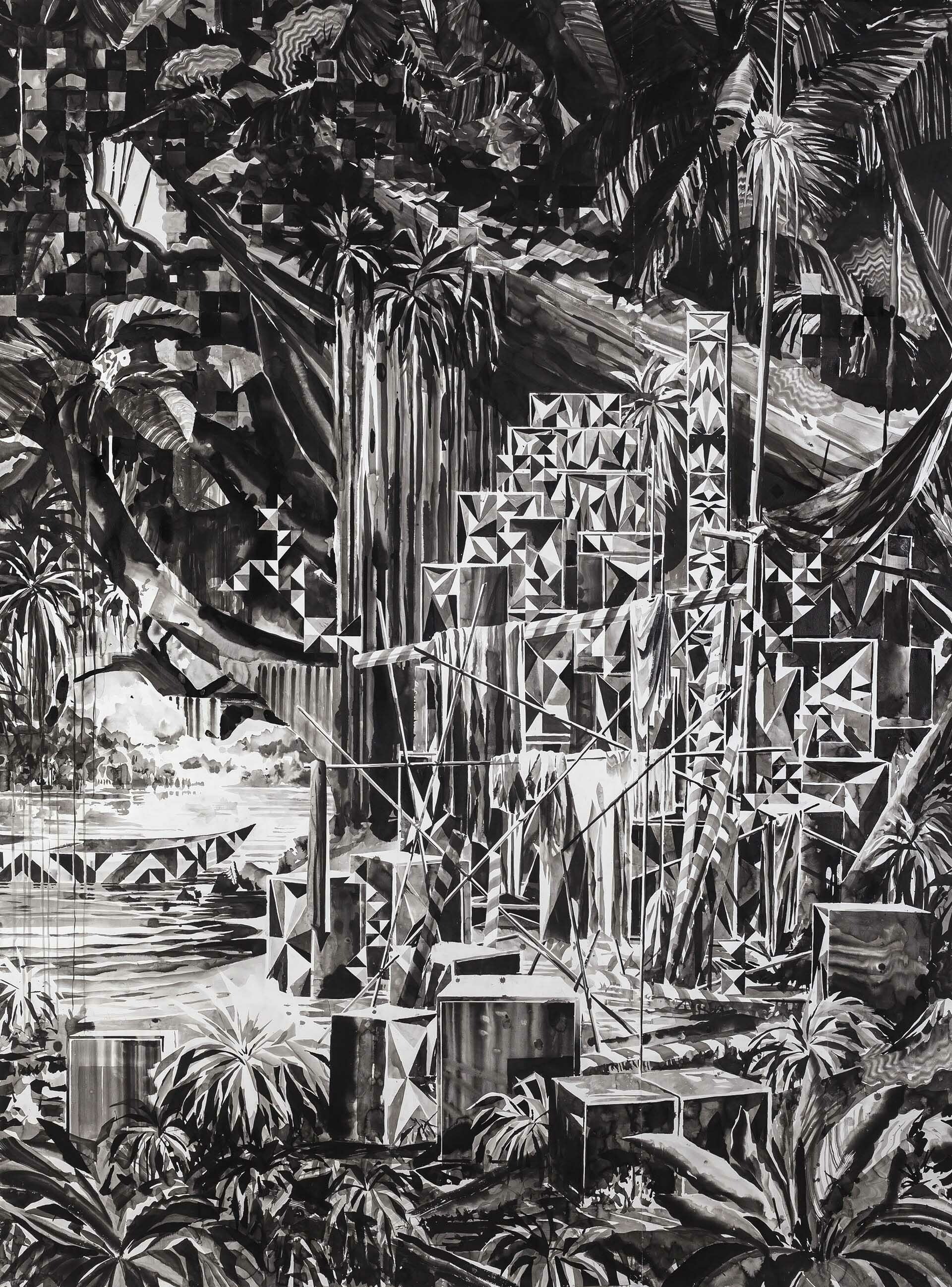
Nik Christenen, Something for the lost and found, 2015. Sumi ink on paper.
Nik Christenen (1973)
Because Nik Christenen likes to work fast, he works with ink rather than paint. By mixing different thicknesses and shades, he creates black and white images with an incredible amount of depth. His works seem to be alive; as if the shapes and shadows change, just as we look the other way. In Something for the Lost and Found there is an interesting interplay between figurative objects and abstract objects. All sorts of random, rectangular objects seem to emerge from the center of the otherwise recognizable, tropical-looking image. The objects form a strong contrast with their surroundings, but at the same time seem to merge with it. This gives the idea of another dimension looming from afar, or a glitch in the world we know, coming to disturb the dreamlike tranquility.
When the internet first came around, it offered endless possibilities for creating a new world. In the beginning, these possibilities were mainly explored with the engineering of video games, but digital art slowly became more and more popular. Take a look at some artists who have mastered the digital world and let their imaginations run wild.
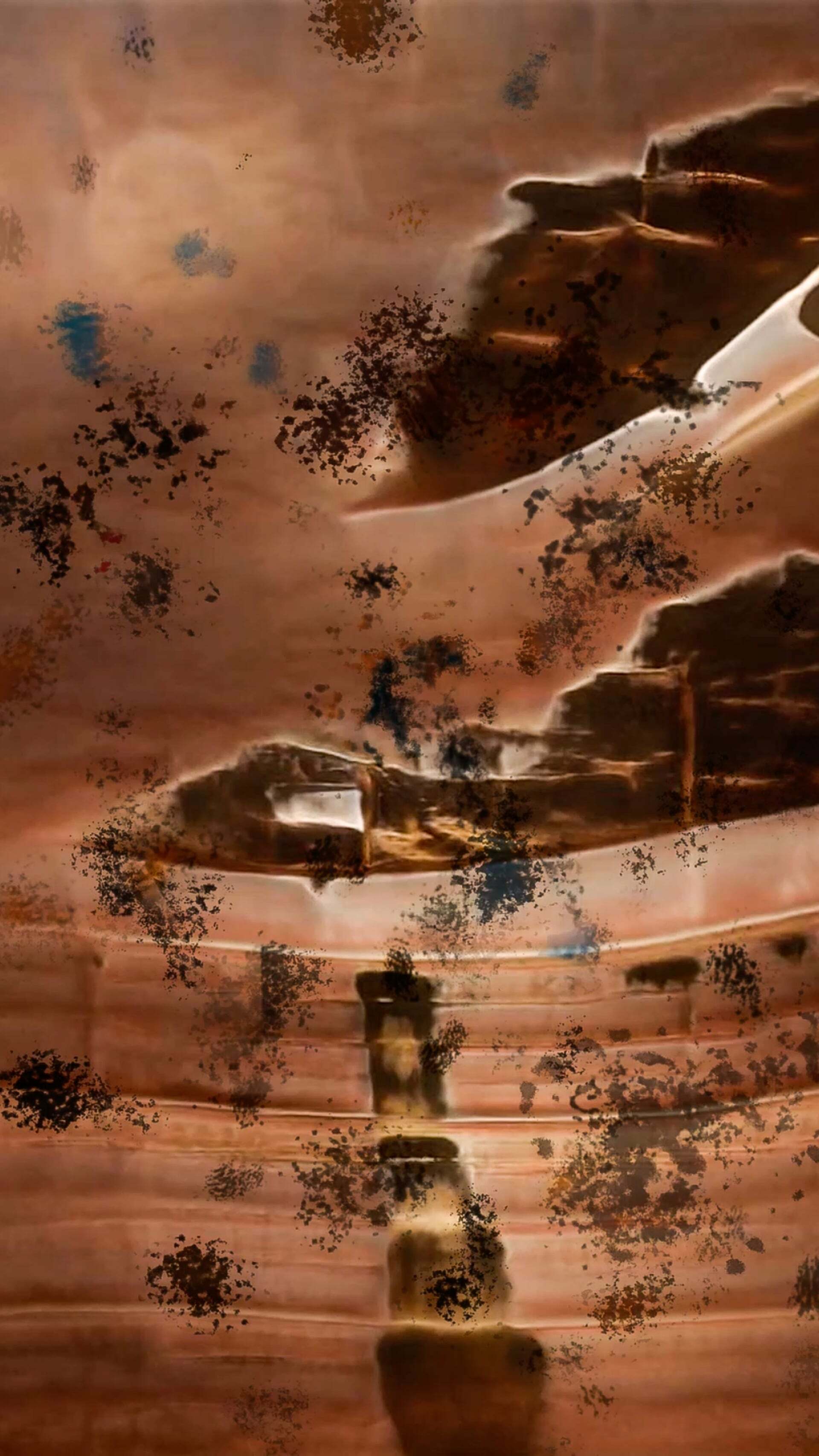
Camilla Ferrari, The Fabric of Change, 2021. Video installation.
Camilla Ferrari (1992)
The Fabric of Change is a collaboration between photographer and video artist Camilla Ferrari and creative technologist Simone Verducci. They investigated the resilience of visual art using artificial intelligence. Ferrari fed videos of her own life, the memories of the past three years, to a computer. They wondered what a computer would do with a human's memories. Her memories became one big entity. Other people also submitted their own videos via Instagram. These videos enter the original video through a special program and interact with it, causing it to constantly distort and change. The result is a stream of ever-changing images, a representation of a digital world that is never the same twice.
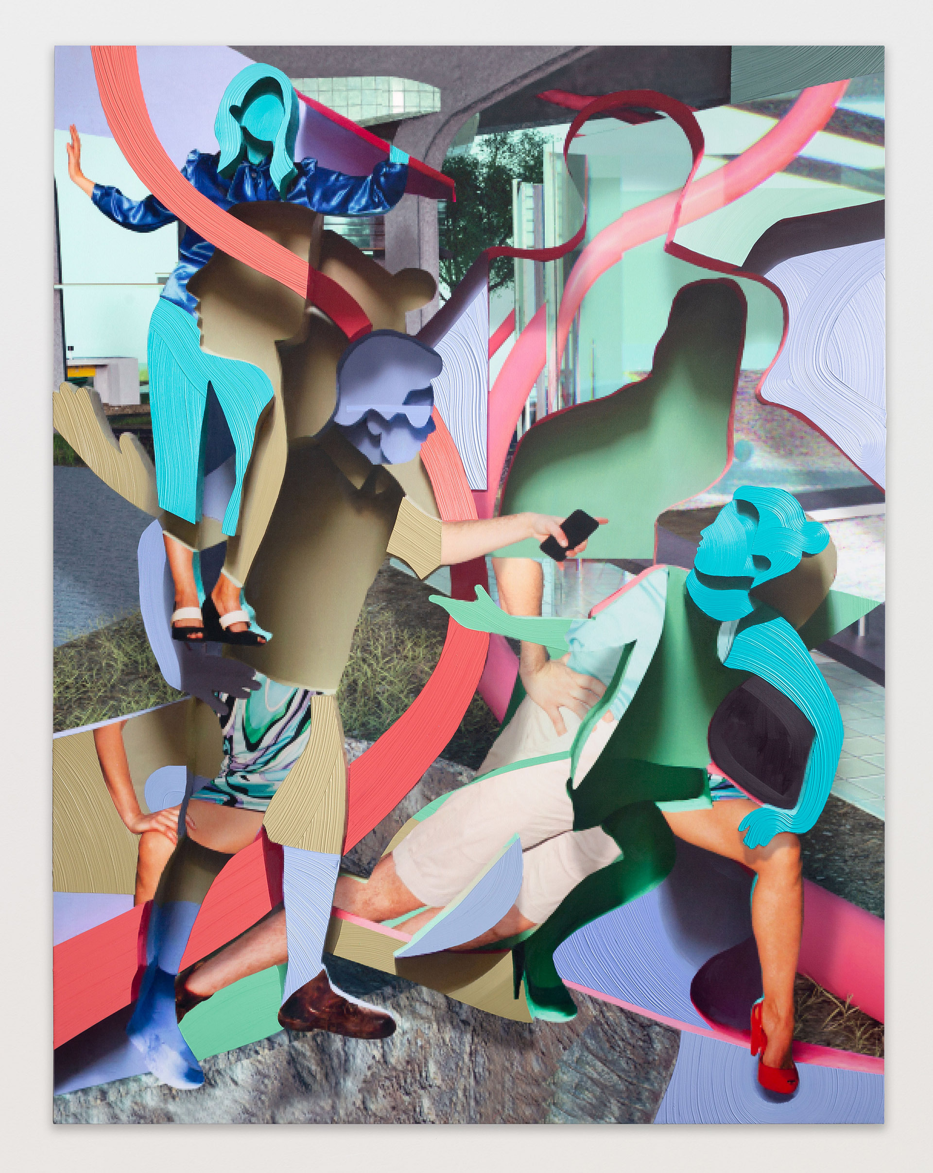
Pieter Schoolwerth, Behavioral Surplus Sculpure, 2019. Oil and acrylic paint and ultrachrome print on canvas.
Pieter Schoolwerth (1970)
When it comes to art and paintings, Pieter Schoolwerth tries to look beyond the standard two-dimensional picture. By adding depth to his work he explores the possibilities of adding multiple dimensions. This ensures that when this work is viewed from different angles, new colours, shapes and patterns can be seen time and again: the artwork moves as you do. He takes analog photos as a basis, which he then digitally transforms into 3d works of art such as Behavioral Surplus Sculpture. With this he shows that every digital work has a physical, material origin. By using all these original images, and deploying them to create an entirely new figurative work, Schoolwerth is able to create an unreal but attractive image that can be explored more than once.
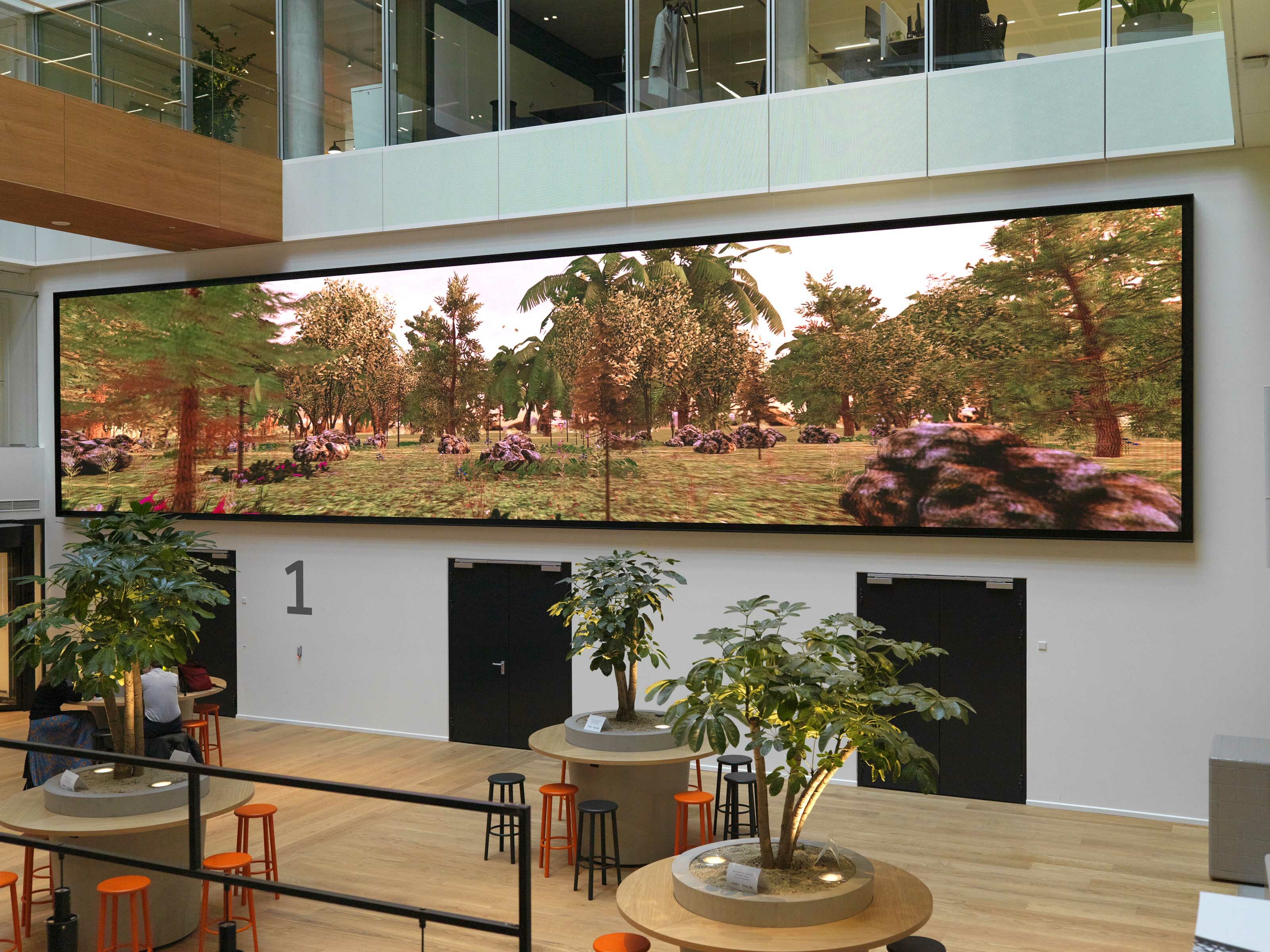
Tabor Robak, Northstar Special Edition, 2019. 4k Generative animation, infinite duration.
Tabor Robak (1986)
With his work Northstar Special Edition, Tabor Robak wanted to capture the feeling he gets from a walk in the woods. According to him, it is the perfect escape from everyday, modern life. He decided to capture this feeling in an endless virtual experience, shown on a 15m wide screen. Using User Interface Software, Robak matches the light in the virtual world to that of the real world; This brings the two worlds a little closer together. The simulation has a a video game feel; it is supposed to. A gaming fan himself, Robak particularly appreciates the design of the expanded fantasy worlds in video games, which is reflected in Northstar Special Edition.
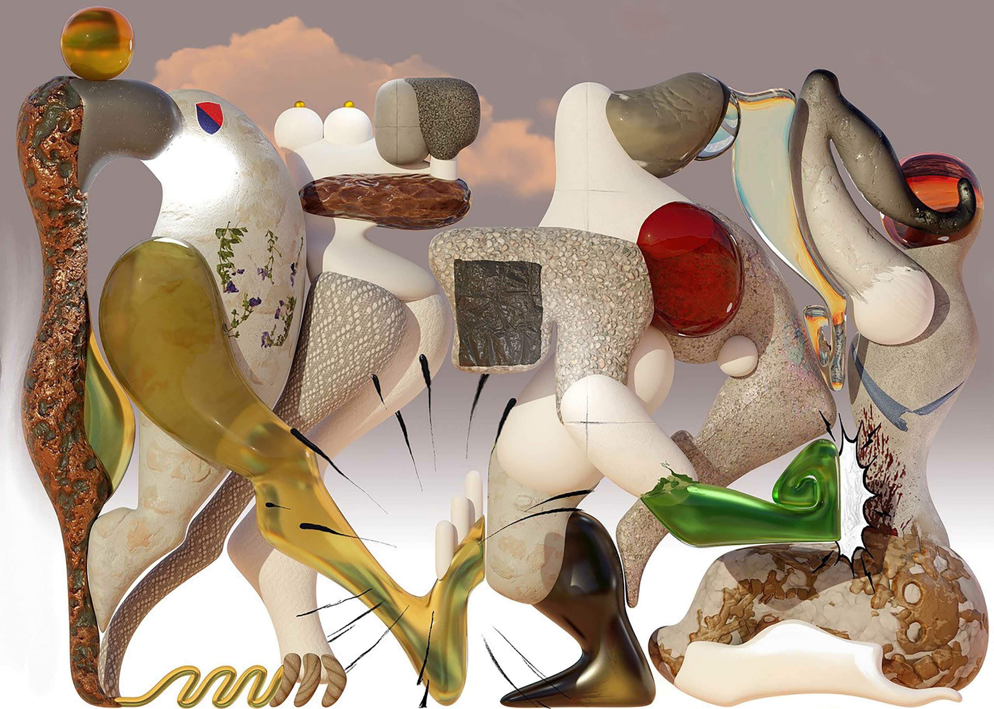
Kevin Bray, It's Following the Orders, 2002. Digital print on canvas, acrylic and oil paint.
Kevin Bray (1989)
Artist Kevin Bray mixes many different modern media, such as video, graphic design and sound design. He likes to explore the possibilities of a technique and use it to create his unpredictable and distinctive shapes. In It's Following the Orders you see a part of his versatility; although it seems to consist of several parts, clearly all the elements are connected in a flow. The different textures are emphasized; there are visible organic stone-like elements that are combined with transparent glass and even textiles. The organic yet futuristic forms that can also be seen in this one, are what he uses to create a surrealistic effect.
Discover
Scroll through a selection of artworks - Wellbeing
Thank you!
We hope you’ve enjoyed this exhibition. We really appreciate this opportunity to share our art – both offline and online – with you. The ING Collection stands for quality, experimentation and innovation. It’s a reflection of topics and themes that are relevant in today’s society and to ING.